
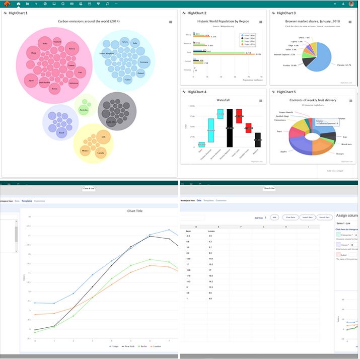
These days charts are not just lines, pies and stacked bars. To tell the story of our data, we have waterfalls, heat maps, gauges, scatter charts, tree maps, polar charts…..it’s a large list.
And it’s not just business data now; there are charts for fitness trackers, distance traveled, sports teams and player stats, finance on the evening news, Facebook page stats, twitter trends, interactive maps and charts embedded in written news stories, to track progress of a federal election…
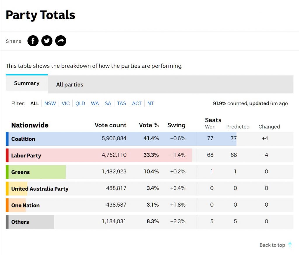
*image source www.abc.net.au
Charts and dashboards are all over the place, translating all sorts of data into an exciting story to follow.
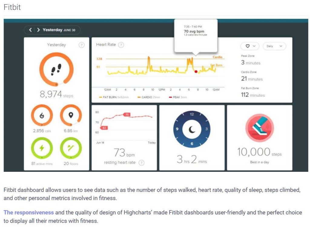
Powering a very large portion of the charts that swish past your screen each day is something called Highcharts – like this Fitbit dashboard:
You can find out more about Highcharts JS here
What we’re really excited about though is our recent addition to deskonline.cloud
We’ve been on a mission to bring a world class chart and dashboard solution into deskonline.cloud and we’ve done it.
Highcharts is now available as an app in your deskonline.cloud space!
A well curated set of charts is a great way to create a visual story of your project or business. This shows progress across KPI’s and planned business outcomes in a quick and easy to understand format; a really valuable tool for efficient and fact based decision making forums.
Follow deskonline.cloud on Linked In to see how easy it is to create your very own schmick looking dashboard of charts, populated with your own data. You can also follow deskonline.cloud on Facebook